Skip to content
  • View menu
  • View sidebar

Digixav

All Things Tech

  • Podcast
  • Reviews
  • About
  • Contact Us
  • Twitter
  • Facebook
  • YouTube
  • Email

Recent Posts

  • i.am+ meets Three as will.i.am again regurgitates his tech mogul dreams
  • Digixav Podcast 022: Searching For Pie
  • Steve Jobs review
  • Digixav Podcast 021: Fontcast
  • iOS 9 review

Tag / WP

Friday February 17th 2012Friday February 17th 2012 by Xavier Voigt-Hill

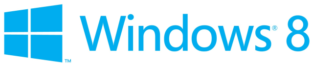
Microsoft’s Metro-style logo for Windows 8 surfaces

  • PC, Tablets, The Poll
  • Logo, Microsoft, PC, Segoe, tablet, tablets, The Poll, UI, Windows, Windows 8, Windows Phone, WP
  • 1 Comment

Microsoft today unveiled a new logo for Windows 8 to fit more with the Metro design language that has won much praise from media and consumers alike. The logo uses the Segoe typeface that is making its way into all Microsoft branding and products, but the traditional flag has been replaced with a strangely angled flag window. Unlike the actual design of Windows 8, I don’t like this at all. What do you think? Let us know in the poll below.

Share:

  • Share on Facebook (Opens in new window) Facebook
  • Share on X (Opens in new window) X
Like Loading...
Create a free website or blog at WordPress.com.
Privacy & Cookies: This site uses cookies. By continuing to use this website, you agree to their use.
To find out more, including how to control cookies, see here: Cookie Policy
  • Subscribe Subscribed
    Digixav
    Join 91 other subscribers

    Have a WordPress.com account? Log in now.

  • Digixav
    View site in Reader
    Manage subscriptionsSign upLog in
    Report this content
    Collapse this bar
Loading Comments...
%d